Highgate Station 1990 chalk pastel on paper 15 x 20 inches
A criticism sometimes levelled at an artist’s work is to say that it is “art for art’s sake” - that the picture was made simply for itself or lacks any conviction in communicating a greater meaning or measure of formal design or discipline. Throughout my formal art education I was frequently challenged when learning how to communicate effectively through art. It often threatened my comfort zone (“busy brushes, happy hearts” as my art foundation tutors would say).
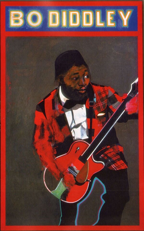
PETER BLAKE Bo Diddley 1963 (Image: rudedo.be)
My A level examination paper in 1990 challenged me to produce artwork more relevant than simply making comfort zone schoolboy drawings of subjects like famous footballers. The A level project required me to produce a body off work and a final piece that captured the essence and feel of an abandoned railway station. The derelict Highgate high level station wasn’t too far away from where I lived at the time so I was able to visit there and created several research drawings. The art teachers gave me a hard time as it wasn’t enough for me to produce basic sketches brick buildings and tunnels. I had to emphasise the fabric and physical atmosphere of a forlorn and neglected place. The final piece (see above) was a conglomeration of the sketches I made plus some imaginative changes to push the concept through (the anachronistic enamel Underground sign was not actually present.)
The Left Banke 1992 acrylic and emulsion paint on card 16.5 x 23.5
My art foundation course exposed me to a whole new level of artistic and conceptual communication - and the critique that it brings. I remember seeing British pop artist Peter Blake’s painting Bo Diddley at a Royal Academy exhibition. The image made a novelty impression on me at the time and I later attempted to create some paintings that featured my own favourite bands. Where Blake worked within the Pop Art philosophy of projecting icons of mass market celebrities and consumer culture, I merely ended up producing fan art like The Left Banke.
Liverpool Street Station 1993 acrylic on paper 11 x 7 inches
My art degree course was equally as challenging in producing images that had to communicate specific things. I recall nervously attending many a peer group critique session and having my work questioned. “What are you trying to get across?”, students would remark, or “I don’t get a sense that the picture communicates that”, another student would comment. Yet it was during these gatherings that one learned to see one’s work objectively and find solutions.
The tutors also had a great appreciation for fine art. They often pointed me in the right direction by referring me to look at artists whose work might be of use when working on a particular project e.g. My tutor suggested I take a look at German-British painter Frank Auerbach’s gritty urban architectural landscapes after I showed him a painting from a project based at Liverpool Street Station.
FRANK AUERBACH Mornington Crescent 1970 oil on board 48 x 60 inches (Image: Marlborough Gallery)
Frank Auerbach had a strong energetic and cursive approach to capturing the physicality of modern structures. Perhaps this is where the aesthetic of fine art allows for something greater than either just simply a photographic rendition or an illustrative idea. It is through the very fabric of the artwork that the communication takes place. The picture takes on a life of it’s own.
DANNY MARKEY (Image: Redfern Gallery)
It takes much effort, observation and reflection to stick to the intention when creating work. How, for example, does one create observational work that emphasises the very uninteresting nature of something, say a deserted park on a cold grey day, but made in an interesting way?
Danny Markey’s very mundane depictions of UK suburban landscapes convey this banality successfully to such a degree that they almost depict a real life dystopian existence. It takes courage to paint things that other people might find ugly or boring, but that is part of what artist vocation is ultimately about: The need to produce work about things that the artist cares about and the struggle to communicate that successfully.


